

Overview
Introduction
A crypto chart is a record of prices over time. It does not begin with a pattern or indicator. It begins with what was traded, where it was traded, the interval used to group transactions and the scale used to draw price.
Once those settings are clear, a chart can answer factual questions. Where did the period open and close? How far did price travel? Did volume expand? Is the market making higher highs or lower lows? Forecasts come later. The chart describes what happened before it supports an opinion about what could happen next.
Key takeaways
- What it is. A crypto chart organizes price, time and sometimes volume for a stated pair and exchange.
- Why it matters. A fixed reading order prevents timeframe, scale and indicator choices from distorting the observation.
- Main risk or limitation. Patterns and indicators summarize past data and can fail, especially in thin or fast-moving markets.
Start With the Pair, Exchange, and Price Source
BTC/USD and BTC/USDT are not identical records. One is priced against dollars and the other against a token designed to track the dollar. Prices can also differ across exchanges because each one has its own buyers, sellers and order book.
Before reading a chart, record:
- base asset and quote asset
- spot, perpetual futures or another product
- exchange or data source
- timezone and candle cutoff
- whether volume is exchange-specific or aggregated
The current cryptocurrency charts and prices provide a market-wide starting point. For execution, check the actual exchange. Order-book trading mechanics explain why the last traded price can differ from the bid or ask available for a new order.
Choose a Timeframe That Matches the Question
A five-minute candle and a daily candle can cover the same market but answer different questions. Short intervals expose intraday noise and execution detail. Daily or weekly intervals compress that activity and make longer trends easier to see.
Use more than one timeframe in a deliberate order. Start with the horizon tied to the decision, then move one level higher for context and one level lower only when execution detail is needed. A person reviewing a three-month thesis might start with daily candles, check weekly structure and use four-hour data for a closer look. Beginning with one-minute bars can hide the larger move under thousands of small fluctuations.
A candle that is still forming can change its high, low and close. Historical pattern examples use completed candles. Live analysis should state when a candle remains open.
Linear and Logarithmic Price Scales
A linear scale gives equal chart height to equal dollar changes. A move from $10 to $20 occupies the same distance as $100 to $110 because both rise by $10. A logarithmic scale gives equal space to equal percentage changes. A move from $10 to $20 and $100 to $200 both represent 100% and appear comparable.
Linear scales are intuitive over short windows with modest percentage change. Log scales are often more informative for long histories in which price has multiplied many times. Trend lines can look different after switching scale, so the chosen scale belongs in any chart-based claim.
The long-term Bitcoin price record is a useful case for checking both views. The choice does not change the raw prices. It changes the geometry used to display them.
How Candlesticks Show OHLC Prices
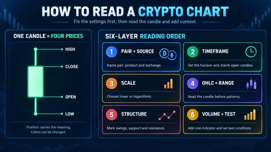
Each standard candle describes four prices during one interval:
- Open: the first recorded price
- High: the highest recorded price
- Low: the lowest recorded price
- Close: the final recorded price
The body spans the open and close. The upper and lower wicks extend to the high and low. A common color setting uses green when close is above open and red when close is below open, but chart colors can be changed. Position, not color, carries the information.
CME's candlestick and OHLC explanation confirms that candlestick and bar charts show the same four fields in different visual forms. CryptoSlate's basic candlestick term definition is a quick reference for the same structure.
A long body means the open-to-close move was large for that interval. A long wick means price traded farther during the period than the close alone shows. Neither feature predicts where the next candle will close.
Read Trend and Market Structure
Trend is a description of directional structure, not a promise. In an uptrend, successive swing highs and swing lows sit above the previous ones. A downtrend has lower highs and lower lows. A range has repeated movement between an upper and lower area without sustained progress beyond either side.
Mark broad zones before exact lines. Many participants will not use the same price to the cent, and fragmented crypto exchanges can print slightly different highs. A prior resistance area may later act as support, but that role change needs evidence from subsequent trading.
The point of marking structure is to define what would confirm or reject an interpretation. “Uptrend while price holds above the latest higher low” is testable. “The chart looks bullish” does not state what would prove it wrong.
Crypto users sometimes pair price structure with market-wide measures. Reading the Bitcoin dominance chart is a separate task because BTC.D compares Bitcoin's market value with the broader crypto market instead of showing one coin's traded price.
Add Volume After Price Structure
Volume records how much traded during an interval under the data source's rules. Rising volume during a breakout can show that more activity accompanied the move. Thin volume means fewer units changed hands, which makes the level weaker as evidence but does not determine what price does next.
Always check what the volume field measures. Spot units, quote-currency value, contract count and aggregated exchange volume are different. A 24-hour crypto market also lacks one universal open and close, so exchange cutoff and timezone can affect daily bars.
Depth and volume are related but not identical. Historical volume records completed trades. Order-book depth shows current resting interest at different prices. Liquidity at executable size determines how much a new order may move the market.
Use Indicators as Transformations of Price and Volume
An indicator usually transforms data already on the chart. A moving average smooths price over a chosen window. The relative strength index compares the size of recent gains and losses. MACD uses relationships between moving averages. None adds knowledge of an event that is absent from the input.
Indicators have settings and lag. A 20-period average on a daily chart summarizes 20 days, while the same setting on an hourly chart summarizes 20 hours. “Overbought” on RSI describes the indicator's position under its formula. It does not mean price must immediately fall. CryptoSlate's RSI term reference and MACD calculation definition explain those calculations.
Begin with one indicator tied to a specific question. Adding several momentum indicators that use similar inputs can create false confidence because they repeat related information.
A Worked Crypto Chart Reading
Assume a hypothetical daily ETH/USD spot chart on one exchange. The latest completed candle opened at $2,000, traded as high as $2,140, reached a low of $1,960 and closed at $2,100. Volume was 35% above its 20-day average. The prior swing high sits around $2,080, and the latest swing low is $1,880.
The observations are:
- The candle closed $100 above its open.
- The total high-low range was $180.
- Price closed above the prior $2,080 area.
- More volume accompanied the move than on the average recent day.
- The sequence of swings remains higher while $1,880 holds.
The inference is narrower: buyers accepted prices above the earlier high during this completed daily period. Confirmation could come from later closes holding above the area. Rejection could come from a move back into the prior range, particularly if the latest higher low fails.
Now switch to a five-minute chart. That $180 daily range may contain several rallies, reversals and failed breakouts. The short chart does not disprove the daily observation. It divides the same period into smaller units. Ethereum's live price and volume record supplies current data, while this example remains hypothetical.
Chart Patterns Without False Certainty
Triangles, flags, head-and-shoulders formations and double tops are labels applied to price structure. Two analysts can draw the boundaries differently. CME's technical-analysis overview notes that OHLC values are objective while chart-pattern analysis introduces subjectivity.
A pattern becomes more useful when it defines:
- the timeframe and scale
- the exact boundary
- the closing or volume condition for confirmation
- the level that invalidates the setup
- the method used to estimate any target
Do not move a boundary after every close merely to preserve the label. That makes the interpretation impossible to test.
Common Crypto Chart Mistakes
Reading Color Without Checking Settings
Colors can be reversed or customized. Use the open and close positions.
Mixing Exchanges or Products
Spot, perpetual futures and index prices can diverge. Record the product behind the chart.
Ignoring Percentage Scale
A $100 move has a different meaning at $500 and $50,000. Compare returns as well as dollar distance.
Treating Volume as Universal
One exchange's volume is not the whole market unless the provider states how aggregation works.
Using Too Many Indicators
Several indicators can restate the same price history. Keep each one tied to a separate question.
Turning a Pattern Into a Guarantee
Patterns can fail. A risk-controlled trading framework needs exit and size rules that remain valid when the reading is wrong.
A Six-Layer Reading Checklist
- Name the pair, product, exchange, timezone and data source.
- Set the primary timeframe and mark whether the latest candle is complete.
- Choose linear or log scale and state why.
- Read OHLC and the candle's range before naming a pattern.
- Mark swing structure and broad support or resistance areas.
- Add volume and one relevant indicator, then write a confirmation and invalidation condition.
After the six layers, add context. Compare the observation with current crypto market conditions, but do not use a market headline to rewrite what the chart recorded. A full cryptocurrency research process can then add project, token, on-chain and security evidence.
If a chart leads to an exchange decision, compare available cryptocurrency exchanges and specific details such as Kraken's trading setup. Reading a chart well does not remove custody, fee, access or execution risk.
Frequently Asked Questions
What do red and green candles mean?
A common setting makes a candle green when the close is above the open and red when the close is below the open. Colors can be customized, so verify the OHLC values. The body shows the open-to-close move, while the wicks show the high and low reached during the interval.
Which timeframe is best for crypto charts?
The best timeframe matches the question. Long-term research usually starts with daily or weekly charts. Shorter intervals can help with execution but contain more noise. Check one higher timeframe for context and avoid changing intervals only to find a preferred answer.
Should crypto charts use a log scale?
Log scale is useful when a long history covers large percentage changes because equal percentage moves receive equal chart height. Linear scale can be clearer over shorter windows with modest change. State the scale because it can alter the apparent slope and placement of trend lines.
Does high volume confirm a breakout?
Higher volume can show broader activity during the move, which may support the observation. It does not guarantee continuation. Check the volume source, subsequent closes, order-book liquidity and the level that would invalidate the breakout.
Can chart patterns predict crypto prices?
Patterns can organize a hypothesis about repeated price behavior, but they do not determine the future. Their boundaries are partly subjective and failures are common. A useful pattern states its timeframe, confirmation rule, invalidation level and risk plan before the outcome is known.