


Overview
Introduction
If you've opened a crypto chart and noticed a second panel underneath the price with two lines and a series of rising and falling bars, you were probably looking at the MACD indicator. It's one of the most common tools traders use to track momentum, and it shows up by default on most charting platforms. This guide explains what MACD actually measures, how to read each part of it, where it fails, and what else you need to think about before using it on a live trade.
Key Takeaways
- MACD compares short-term and longer-term momentum through the MACD line, signal line, histogram, and zero line.
- Standard MACD settings are 12, 26, and 9, but faster settings can create more false signals on noisy crypto charts.
- Crossovers and divergence work best with trend, support, resistance, volume context, and clear risk limits.
- Crypto traders must account for fees, slippage, spread, leverage, exchange reliability, and tax records before acting on MACD.
What the MACD Indicator Shows on a Crypto Chart
MACD shows whether recent price momentum is strengthening, weakening, or shifting against a longer-term trend measure. The name stands for Moving Average Convergence Divergence, which describes whether two exponential moving averages are moving closer together or pulling apart.
Most charting platforms place MACD in its own panel below the main price chart. That separation is intentional: you want to see both panels at the same time, because a signal on the MACD panel only makes sense against what price is doing above it.
Each part of the indicator has a distinct job:
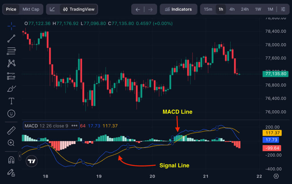
- The MACD line tracks the gap between the faster and slower exponential moving averages.
- The signal line smooths the MACD line and helps identify crossovers.
- The histogram shows the distance between the MACD line and signal line.
- The zero line marks where the fast and slow averages are equal.
One thing to understand early: MACD is built from past prices, so it reacts after price has already moved. That lag is a permanent feature of the indicator, not a flaw to work around. It still helps when it filters out short-term noise and shows whether momentum is building or fading over a meaningful period.
Cryptocurrency adds another layer. The same MACD reading on a Bitcoin price chart, an XRP chart, and a thin altcoin chart can carry different weight because liquidity, spread, venue reliability, and leverage exposure vary significantly across assets.
Here’s how to spot these lines on a chart:
The histogram is the easiest to spot. It's the bar chart, the vertical bars that grow and shrink above and below the zero line. They're usually green when rising and red when falling, though colors vary by platform.
The two lines sit on top of or alongside the histogram:
- The MACD line moves faster and more erratically. It's the raw difference between the 12 and 26 EMAs, so it reacts quickly to price changes and tends to swing wider.
- The signal line is smoother and slower. It's the 9-period EMA applied to the MACD line, so it lags slightly and curves more gently. It's the one the MACD line crosses through when a crossover happens.
How MACD Is Calculated
MACD is calculated by subtracting a slower exponential moving average from a faster one, then smoothing that result into a signal line. The standard parameters are 12, 26, and 9: a 12-period EMA, a 26-period EMA, and a 9-period EMA applied to the MACD line itself.
You don't need to run the math by hand. Every major charting platform calculates MACD automatically. But knowing what the numbers represent helps you understand why the indicator behaves the way it does. The standard formula components are laid out clearly if you want the full breakdown:
| Component | Formula Or Meaning |
|---|---|
| MACD line | 12-period EMA minus 26-period EMA |
| Signal line | 9-period EMA of the MACD line |
| Histogram | MACD line minus signal line |
| Zero line | The level where the fast EMA and slow EMA are equal |
The formula explains the lag. EMAs weight recent prices more heavily than older ones, but MACD still depends on past closes. A fast price move can appear on the main chart before MACD registers it.
Changing the inputs changes how the indicator behaves. Faster settings react sooner and produce more noise. Slower settings filter more noise but react later, which can mean missing part of a fast crypto move before MACD confirms the direction.
How to Read MACD Lines, Signal Lines, and Histograms
Reading MACD means looking at the relationship between the MACD line, signal line, histogram, and zero line together, not treating any single element as a standalone signal. The chart gives you a momentum reading, not a complete trading plan.
Start by separating what each component is saying from what you plan to do about it:
| Signal On Chart | Plain-English Reading |
|---|---|
| MACD line above signal line | Short-term momentum is stronger than the smoothed signal line |
| MACD line below signal line | Short-term momentum is weaker than the smoothed signal line |
| Histogram bars rising above zero | Bullish momentum is expanding |
| Histogram bars falling toward zero | Bullish momentum is fading |
| Histogram bars deepening below zero | Bearish momentum is expanding |
| MACD line above zero | The fast EMA is above the slow EMA |
| MACD line below zero | The fast EMA is below the slow EMA |
A rising histogram can show improving momentum before a crossover becomes visible. A shrinking histogram can warn that the current move is losing force before a reversal prints. Neither guarantees that price will follow through.
Different platforms also style the histogram differently. On some, bar color reflects whether the histogram is above or below zero. On others, color changes when bars start rising or falling. Green bars are not automatically a buy, and red bars are not automatically a sell. Check your platform's documentation if you're unsure what the colors represent.
For comparing platforms built around technical analysis workflows, crypto trading apps covers the main options.
MACD Signals Traders Watch Most
MACD signals point to changes in momentum, trend pressure, or a disagreement between price and momentum. Most traders focus on four types: crossovers, zero-line crosses, histogram shifts, and divergence.
None of these signals are useful in isolation. Before acting on any MACD reading, run through this checklist:
- Check the higher-timeframe trend to see whether the signal is going with or against it.
- Mark nearby support and resistance levels on the price chart.
- Compare the signal with volume where data is available.
- Set your position size, stop level, and trade invalidation point before entering.
- Factor in fees, spread, and slippage before assuming a small move will be profitable.
Bullish and Bearish Crossovers
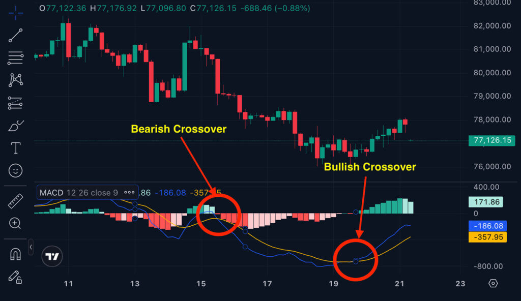
A bullish crossover happens when the MACD line crosses above the signal line. A bearish crossover happens when it crosses below. A bullish crossover can point to improving momentum, but it is not a guaranteed entry trigger. Some traders call it a MACD golden cross, but “bullish crossover” is the more precise term.
Crossovers fail most often in sideways, choppy markets. When price has no clear direction, the MACD line can flip above and below the signal line repeatedly, producing a series of small losses before any real trend develops. If the price chart is moving sideways, treat crossover signals with extra skepticism.
Zero-Line Crosses
A zero-line cross shows that the fast EMA has moved from one side of the slow EMA to the other. When MACD is above zero, recent prices are running stronger than the longer-term comparison period. When it's below zero, recent prices are weaker.
Zero-line crosses can help filter weak signals from stronger ones. A bullish crossover while MACD is still far below zero may only reflect a brief bounce, whereas a MACD move above zero suggests the broader momentum picture has shifted. The tradeoff is that waiting for the zero line often means entering after the early part of the move has already happened.
Histogram Momentum Shifts
Histogram shifts show whether the gap between MACD and the signal line is growing or contracting. Expanding bars show acceleration. Shrinking bars show that momentum is losing force.
Traders who use histogram shifts as confirmation are trying to read the move before a crossover prints, rather than reacting after it. The risk is that a single bar change after a volatile candle can reflect noise rather than a real momentum shift. One bar is rarely enough to act on.
Divergence
Divergence happens when price and MACD move in opposite directions. Bullish divergence appears when price makes a lower low while MACD makes a higher low, suggesting that downside momentum is weakening even as price keeps falling. Bearish divergence appears when price makes a higher high while MACD makes a lower high, suggesting that the upside move is losing its underlying force.
MACD bullish divergence can serve as an early warning that a trend may be exhausting, but it does not confirm that a bottom is in place. A strong trend can continue for a significant time while divergence signals are active. Divergence works better as an alert that warrants closer attention than as a standalone reason to trade.
MACD Indicator Chart Example Without a Live Signal
A good MACD chart example teaches the indicator's parts without implying a current trade. Imagine a static Bitcoin chart where price trends upward, stalls near resistance, and then pulls back while MACD weakens in the panel below.
You can read the sequence in three steps:
- First, the MACD line crosses above the signal line and the histogram moves above zero, reflecting building momentum during the uptrend.
- Next, price makes a higher high but the MACD histogram fails to match the same strength, showing that the move is losing force even while price is still rising.
- Finally, the MACD line crosses below the signal line and the histogram falls toward zero, giving a later warning of the pullback already underway.
That sequence shows improving momentum, fading confirmation, and a delayed warning signal. It doesn't say the trade would have been safe or that a specific Bitcoin setup exists right now.
One thing beginners often miss in this type of example: the divergence in the second step (price higher, MACD lower) appeared before the crossover in the third step. That's the point. Divergence can give you earlier information, but it requires reading both panels together rather than watching MACD in isolation.
The same teaching structure works with other assets, but any example should stay illustrative.
Best MACD Settings and When to Change Them
The best MACD settings depend on the asset, timeframe, trading costs, and trading style. Standard settings of 12, 26, and 9 exist because they represent a reasonable default across many scenarios, not because they are always optimal.
Changing the settings shifts the speed-versus-noise tradeoff in a predictable direction:
| Setting Choice | What Changes |
|---|---|
| Standard 12, 26, 9 | Balanced default for many chart timeframes |
| Faster settings | Earlier signals with more whipsaw risk |
| Slower settings | Fewer signals with later confirmation |
| Custom settings | Must be tested against fees, slippage, and asset behavior |
Day traders often use faster inputs to get earlier signals on lower timeframes, but shorter crypto charts can be particularly noisy. A five-minute Bitcoin chart may show MACD flipping direction repeatedly inside a range, especially when the spread widens or liquidity thins during off-peak hours.
Changing settings to match a chart that already looks clean is one of the most common mistakes. If you adjust the inputs until past signals look perfect, the settings are fitted to historical noise rather than tested on new data. The discipline used by quant trading companies provides a reference point: real parameter testing uses out-of-sample data, accounts for fees and slippage, and tests across different market conditions, not just a stretch of chart that happened to work.
MACD Trading Strategies and Where They Fail
A MACD trading strategy uses the indicator as a rule-based input for entries, exits, filters, or alerts. It should not be the only reason you risk capital.
Common MACD strategy structures follow these patterns. Each one is paired with the specific failure mode worth knowing before you use it.
- Crossover strategy: enter after the MACD line crosses the signal line. Fails in choppy sideways markets, producing repeated small losses before a real trend develops.
- Trend-confirmation strategy: take bullish signals only while MACD is above the zero line. Misses early-trend entries and can still fail when the broader market reverses sharply.
- Divergence strategy: compare price lows or highs against MACD lows or highs for early warnings. Strong trends can extend far beyond any divergence warning, leaving you out of a profitable move.
- Histogram momentum strategy: use expanding or contracting bars as confirmation before a crossover appears. A single bar change after a volatile candle can reflect noise rather than a real shift.
- Multi-timeframe strategy: require the higher timeframe to support the direction of the lower-timeframe setup. Slower timeframes can lag so much that the lower-timeframe entry is already over.
Cherry-picked chart examples hide losing streaks by showing only the periods where signals worked. Overfitted settings appear to work on historical data and then fail immediately when conditions shift.
MACD belongs inside a broader trading plan that keeps chart analysis separate from order execution. On spot markets, a false signal is a contained loss. On crypto perpetual futures, the same false signal can trigger a liquidation before price has time to recover.
MACD Vs RSI, Moving Averages, and Other Indicators
MACD differs from RSI, simple moving averages, and the Awesome Oscillator because it focuses specifically on the relationship between two moving averages and the momentum that relationship implies. RSI measures the speed and size of recent price gains against recent losses, while moving averages smooth price directly without the momentum layer.
That overlap is worth thinking about before combining indicators. Adding more tools to a chart only helps if each one is asking a different question:
| Indicator | What It Adds Or Misses |
|---|---|
| MACD | Tracks trend momentum, but can lag and whipsaw |
| RSI | Highlights overbought or oversold pressure, but can stay extreme in strong trends |
| Moving averages | Show trend direction, but give less momentum detail |
| Awesome Oscillator | Compares momentum around a midpoint, but can duplicate MACD-style signals |
RSI and MACD are not competing choices. RSI can help identify stretched price conditions, while MACD shows whether the underlying momentum is building or fading. Using both together gives you two different readings from the same chart rather than two versions of the same reading.
The Awesome Oscillator works similarly to MACD in principle because both are momentum tools built from moving average comparisons. MACD also appears in stock, forex, and commodity markets, but crypto charts carry different execution risks because of thinner liquidity on smaller assets, wider spreads, and the absence of circuit breakers.
Using MACD in Crypto Without Ignoring Execution Risk
Reading the chart correctly is only part of using MACD. What happens between a signal appearing and an order being filled depends on execution quality, and execution quality depends on factors that have nothing to do with chart patterns.
Work through these before treating any signal as actionable:
- Fees reduce the net result of every entry and exit, including small ones.
- Spread means market buys and sells execute at a worse price than the mid-market quote.
- Slippage pushes fills further from the expected level when order-book depth is thin.
- Order-book depth determines whether your size can execute without moving the market against you.
- Exchange reliability affects whether orders, stops, and withdrawals function when you need them most.
If you're comparing platforms for active trading, the best exchanges for day trading crypto covers the main options. A platform that works well for large BTC pairs may still have weak liquidity on smaller altcoin pairs.
Market structure also shapes how signals play out. On-chain trading adds a separate set of considerations because decentralized exchanges involve pools, routing, gas costs, and smart-contract exposure that don't appear on a MACD chart. The top crypto derivatives exchange comparison covers venue categories and explains why leverage changes the risk profile on each one.
Backtests also tend to look better than live trading because they don't account for maker-taker fees, spread, missed fills, and slippage the way real execution does.
FAQs
What does MACD stand for?
MACD stands for Moving Average Convergence Divergence. The name comes from the way two exponential moving averages converge, diverge, and produce a momentum reading.
What is the best MACD setting?
There is no single best setting. Standard MACD settings are 12, 26, and 9. Faster or slower alternatives should be tested against the specific asset, timeframe, fees, spread, and slippage before being used on live trades.
Is MACD better than RSI?
MACD is not automatically better than RSI. MACD tracks trend momentum through moving averages, while RSI measures recent gain and loss pressure. The more useful tool depends on what question you’re trying to answer.
Does MACD work for Bitcoin?
MACD can work on Bitcoin charts as a momentum tool, but it does not predict the next move on its own. A Bitcoin MACD signal still needs trend context, liquidity checks, cost accounting, and defined risk limits before it’s worth acting on.
What is a bullish MACD crossover?
A bullish MACD crossover happens when the MACD line crosses above the signal line. It can indicate improving momentum, but it is not a buy signal without confirmation from the broader chart context and a risk plan.
Can MACD predict the next crypto move?
MACD cannot predict the next crypto move with certainty. It can flag momentum shifts and possible trend changes, but false signals, volatility, leverage, and execution costs can still produce a losing trade on an otherwise clean-looking chart.